
Typeface for macOS
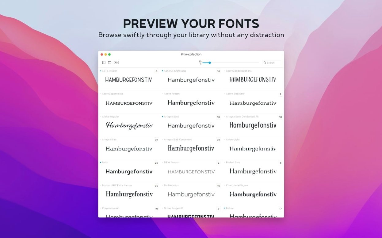
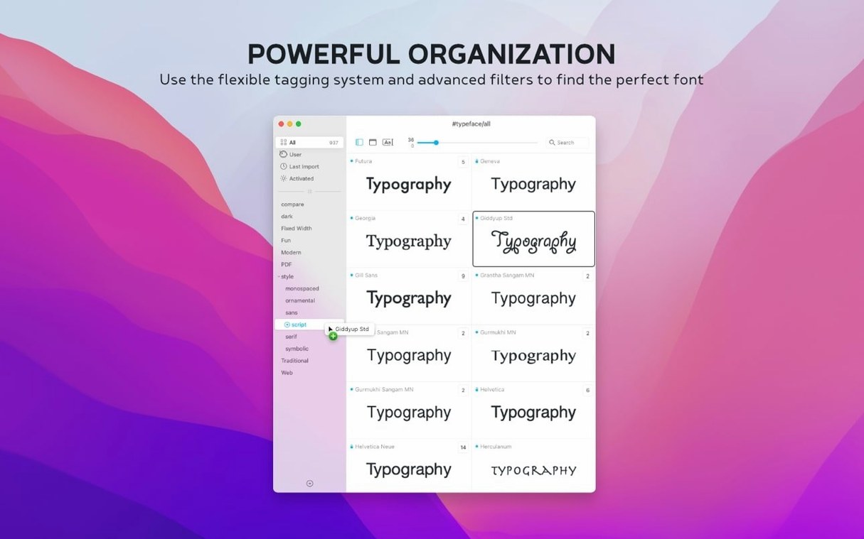
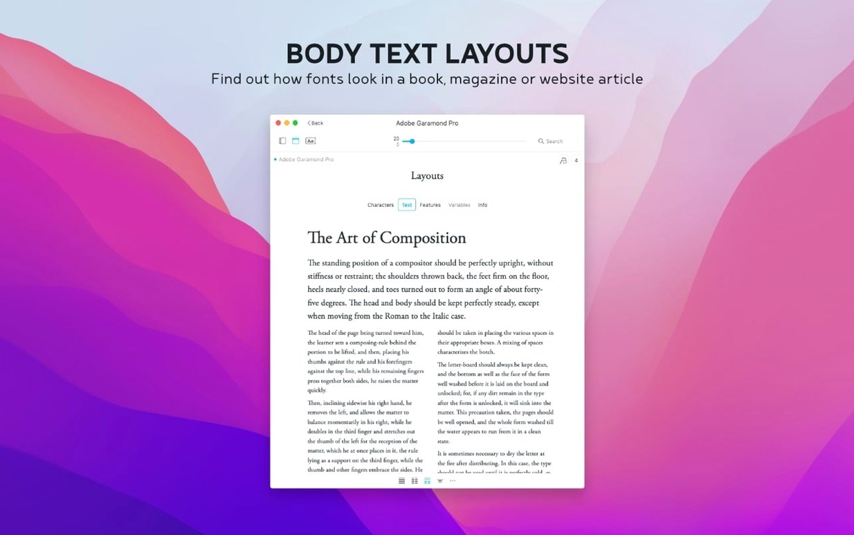
Designers who need to sift through hundreds of fonts without a sluggish interface tend to reach for Typeface. It is a standalone browser for your type library, built to let you compare faces side by side without leaving your current project.
Font preview — Set a custom sample text and see it rendered across your entire collection. You can adjust size on the fly and toggle between uppercase, lowercase, numerals, and special characters for any face.
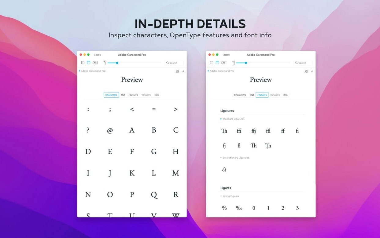
Glyph set — A dedicated view shows every character a font contains, so you can check for missing symbols before committing to a family.
Info tab — Displays the metadata buried in the file: copyright history, designer credits, tags you have added, and which groups the font belongs to.
Sources — It reads everything macOS already knows about, plus any custom .otf, .ttf, or .otc files you drag in from the internet or other managers.
Sorting — Version 4.5.0 introduces a Last Activated column. If you frequently grab a font for a quick job, you can now sort by recency and keep your workhorses at the top.
What settings are worth changing first?
Out of the box Typeface shows every installed font in a flat list, which can feel like drinking from a fire hose. A few tweaks make it behave more like the focused tool it really is.
Switch the default grouping. Open View in the menu bar and pick Group by Family. Instead of scrolling past 14 weights of the same sans-serif, you get one collapsible row per family. For libraries with large superfamilies this alone cuts the visual noise in half.
Set your sample text early. The preview pane defaults to a pangram, but you will get more useful results by pasting in a headline you are actually working on, or a short block of body copy. Typeface remembers this string between sessions, so set it once and every future browsing session is grounded in real content.
Adjust the preview size range. The slider goes from tiny to billboard, but the sweet spot for body-text evaluation is between 14 and 24 points. For display faces, bump it higher. The app does not lock you to stepped sizes; you can type an exact number into the size field.
Turn on the glyph grid early. Click the grid icon to see the full character set of whatever font is selected. Not every .ttf ships with fractions, old-style figures, or a proper @ sign. Spotting gaps in the glyph coverage before you design around a typeface saves backtracking later.
Tags before chaos. If you import a batch of Google Fonts or trial faces from a foundry site, spend two minutes tagging them. Tags like display, text, mono, or client-x turn an undifferentiated pile into something you can filter with one click. A font can carry multiple tags, so a single family might live under both sans and pitch-deck at the same time.
Hunting a loud display face, a readable sans, and a swash date block
You are mocking up a poster and need three typefaces: a loud display face, a readable sans for the event details, and something with swash alternates for the date block. Typeface is already running in the background.
1. Narrow the field. You type slab into the search bar. The library filters to slab-serif families. You click through five or six, previewing each with the actual poster headline you pasted into the sample field earlier. Two candidates get a quick tag: poster-shortlist.
2. Side-by-side comparison. You select both shortlisted families and open the comparison overlay. The same sample text renders in both faces at the same point size, stacked vertically. You adjust tracking slightly using the preview controls and one face clearly holds up better at 72 points. Decision made.
3. Hunt for swash details. For the date block you need a face with decorative alternates. You switch to the glyph grid view and scan through a few serif families, looking for the swash variants in the character set. When you find one with the right alternates, you open the Info tab to check the designer metadata and confirm it is safe for commercial use.
4. Tag and move on. You tag the chosen date face as approved and close Typeface. Back in your design app, the three font names are clear in your head because you just spent ten minutes staring at them in real copy, not in alphabetical lists of Lorem Ipsum.
A workflow for sorting a bloated font library
Font libraries accumulate cruft. Old freebies, trial cuts that expired three macOS versions ago, and duplicate families with slightly different naming conventions all pile up until browsing becomes a chore. Typeface gives you a systematic way to triage.
Start by creating a new collection called Inbox. Drag everything you have added in the last six months into it. This is your working set.
Open the Info tab for the first font in the Inbox. Check the metadata: if the copyright field is blank or the designer name reads Unknown, that is a red flag. Tag it needs-review. If the glyph grid shows missing punctuation or a character set too thin for your usual work, tag it incomplete.
Work through the Inbox in chunks. After 15 minutes you will have a cluster of needs-review and incomplete tags. Filter by those tags, select everything, and drag the lot into a second collection called Quarantine. You do not delete them yet. You hide them from daily view.
For fonts that survive this first pass, add descriptive tags that match how you actually search: condensed, humanist, rough, stencil, monospace-code. The search bar in Typeface matches against tags, family names, and now (since 4.5.0) notes, so a note like used in Q4 campaign headlines becomes a searchable breadcrumb months later.
Finally, click the Last Activated column header. Any font that has not been touched in over a year is a candidate for the Quarantine collection. A quiet library is a fast library.
Typing 13.5 points straight into the size field
Exact-size entry. The size slider is handy for quick sweeps, but double-clicking the number next to it lets you type an arbitrary point size. If you need to preview at 13.5 points for a specific layout grid, you can.
Quick family collapse. In Group by Family mode, holding Option while clicking a disclosure triangle collapses or expands every family at once. Useful when you want a clean slate before drilling into one superfamily.
Drag import from anywhere. You can drag a .otf or .ttf file directly from a Finder window, a zip archive you opened, or a browser download shelf onto the Typeface window. The app does not force you through an import dialog.
Copy character from the glyph grid. Click any glyph in the grid view to select it, then press Command-C. The character lands on your clipboard, ready to paste into a design document. This is faster than hunting through the system Character Viewer for obscure Unicode points.
Notes are searchable. The 4.5.0 update added a Notes field in the Info tab. Type something like good pairing with Work Sans or client vetoed this for the logo. The main search bar picks it up, so a note you write today becomes a filter six projects from now.
Keyboard-only browsing. Arrow keys move through the font list. Pressing Return on a family expands it. If you prefer keeping your hands off the mouse, the entire browsing flow works from the keyboard.
Resizable preview pane. The divider between the font list and the preview area is draggable. On a smaller laptop screen, shrink the list and give the preview more real estate. On a wide display, expand the list to see more metadata columns at a glance.
Version 4.5.1 ships with the developer's latest fixes and improvements. Full details are available in the release notes on the Typeface website.
- macOS 12 or later
- Apple Silicon or Intel 64‑bit
$ man typeface | grep -A2 "?"
Does Typeface install fonts system-wide?
No, it reads from the standard macOS font directories and lets you preview custom files without altering your system library.
Comments 0
Sign in or create an account to leave a comment.
No comments yet. A codec, a slice, a machine — they appear after moderation.